Intro
User friendly invoicing for privacy conscious businesses
Anchor embraces data privacy by installing directly on a business' server, ensuring that no one has access to data unless they explicitly given permission.
There is no shortage of invoicing apps for businesses to choose from. It's an extremely crowded market and there are new entrants every year, but one segment of the market is continually ignored - those who require on premise software.
Existing on premise invoicing apps are expensive, lack critical features, or difficult to setup. Anchor is priced for every business, regardless of size, and has all of the features required to invoice effectively while also being easy to install.
01 Challenge
Anchor was not meeting it's stated goals
The first version of the app did not have an intuitive user experience. It was also missing critical features that could make billing easier and missing the flexibility required to be useful to all types of businesses. Many invoicing processes were manual and still needed to be performed outside of the app.
02Solution
Rebuild Anchor with focus on requirements and goals
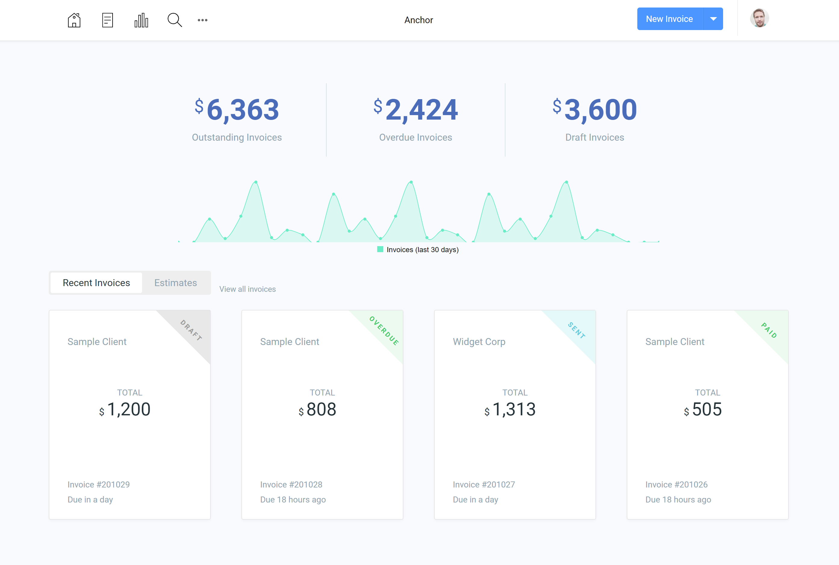
To effectively provide the user experience and tools necessary to make billing easier, it was clear Anchor needed to be redesigned and rewritten rather than a simple update. The entire app was rebuilt with a focus on UX, automating processes, and providing greater flexibility.
03Results
Easier & more flexible invoicing at a fraction of the cost
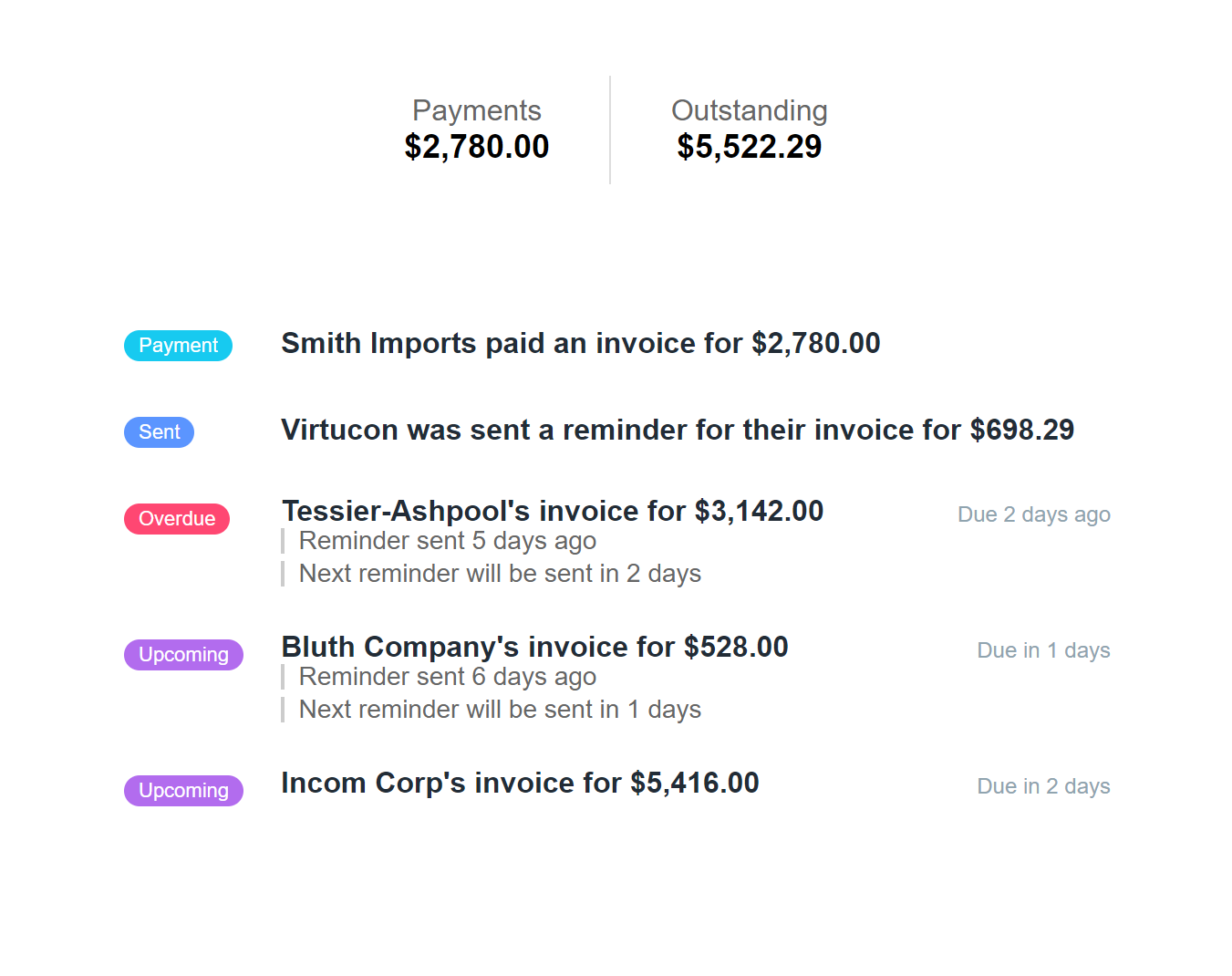
Sending invoices is easy, getting paid is hard. Many clients need several reminders and this can be time consuming and frustrating. Anchor automatically reminds clients on a customizable schedule, and sends you a detailed status of each invoice. This automation combined with a greatly improved user experience, makes Anchor one of the best invoicing tools on the market.
The vision is to provide a "best in class" invoicing experience
This was the primary goal when rebuilding Anchor and achieving this goal meant we needed to do three things: Create an intuitive friendly user interface that has no learning curve, automate manual processes that are time consuming, and make it easier to get paid, with as little work as possible
Building the app
User Interviews and assessment of old version
The first step was to talk to existing users of Anchor to get a better sense of what they need from their ideal invoicing app and to discuss their specific pain points with the existing version of Anchor. This information was used to define the direction for the design phase.
Wireframing & Design
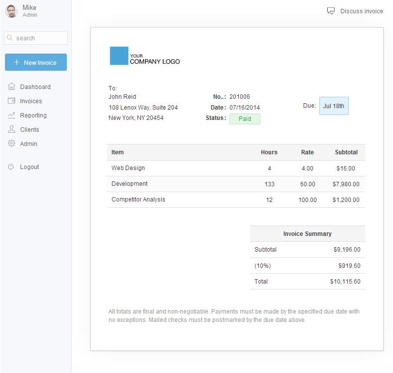
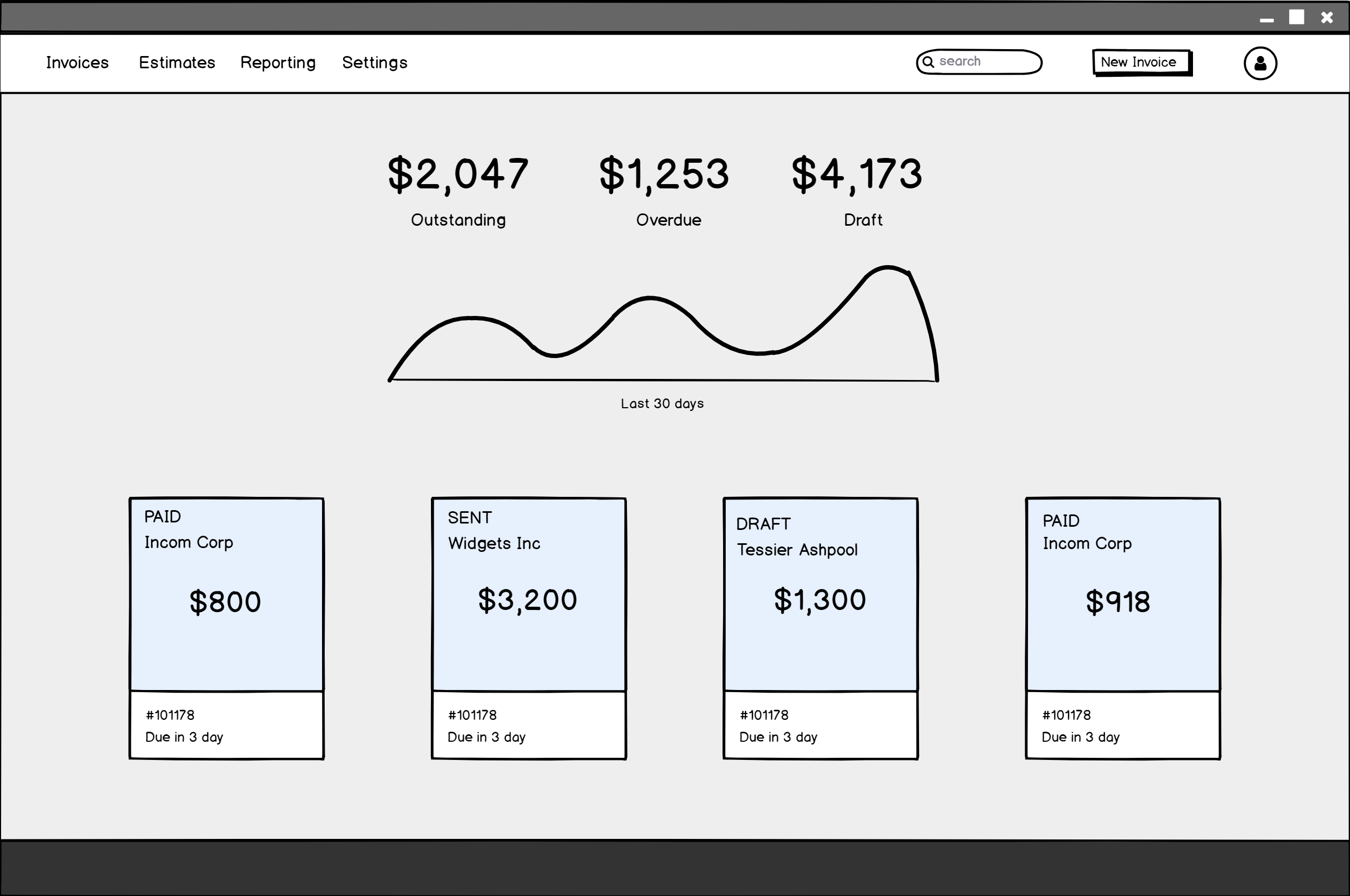
Next we analyzed the information from the user interviews to rapidly prototype new designs and features. Then used those wireframes to redesign the app taking into account user feedback and business goals.

Code & Deploy
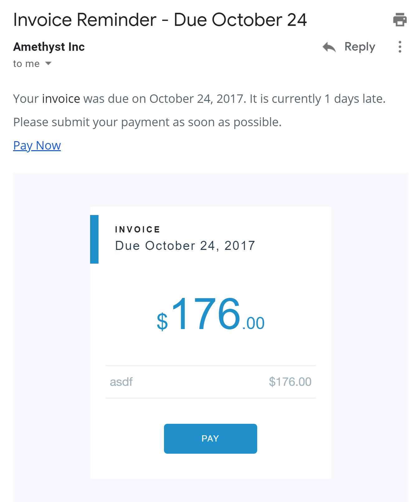
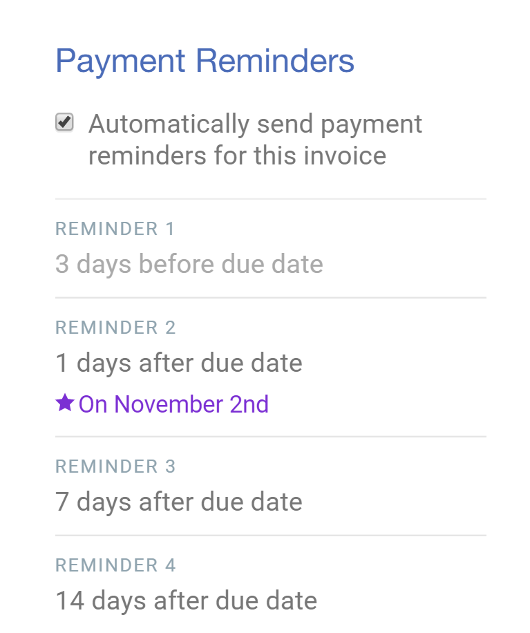
Use automatic invoice reminders to stop chasing late payments
Sometimes clients pay late. Chasing late payments is time consuming and frustrating. Anchor can automate this process with it's customizable invoice reminders. The reminder schedule is completely customizable for each individual invoice and a user can schedule as many reminders as they would like.
Automated daily status updates
It's easy for users to stay informed of all billing activity with Anchor's automated daily summary delivered directly to their inboxes. It shows the status of all upcoming and overdue invoices, recent payments, and recent reminders, so so they will always be up to date.
